

MINISTRY OF UGLINESS
— VISUAL IDENTITY
After a broad research relating to the concept of the ugliness around the world, the conclusion is simple, subjectivity. It was then, around this concept, that the formula for this identity was created.
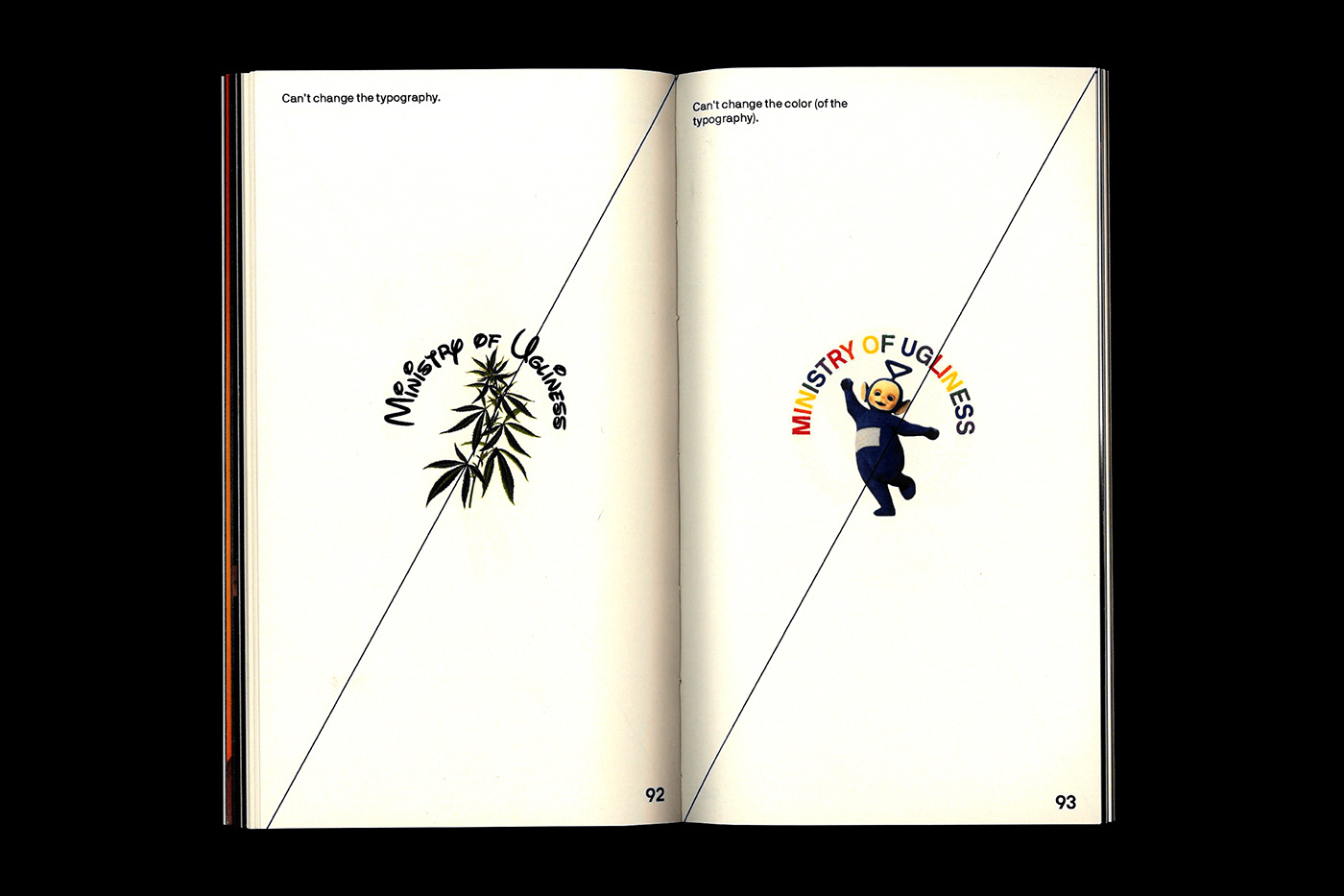
In the logo, typography is a primordial element that conveys the idea of council/meeting through a circular shape in which it is founded circumscribed. The striking character, although neutral from the body of the typeface’s letter, allows for some transparency where the ugly concept of each individual will appear.
Through the variable and personal component that the brand presents, it is possible for each person to convey their own concept of the ugliness and what it represents to themselves. The brand should, therefore, appeal to reflection and creativity, so it is true to each one’s concept of ugliness, as possible.
— VISUAL IDENTITY
After a broad research relating to the concept of the ugliness around the world, the conclusion is simple, subjectivity. It was then, around this concept, that the formula for this identity was created.
In the logo, typography is a primordial element that conveys the idea of council/meeting through a circular shape in which it is founded circumscribed. The striking character, although neutral from the body of the typeface’s letter, allows for some transparency where the ugly concept of each individual will appear.
Through the variable and personal component that the brand presents, it is possible for each person to convey their own concept of the ugliness and what it represents to themselves. The brand should, therefore, appeal to reflection and creativity, so it is true to each one’s concept of ugliness, as possible.


MINISTRY OF UGLINESS — VISUAL IDENTITY
11 x 19,5 cm
Munken Pure 90G/S & Couché Gloss 135G/S
Munken Pure 90G/S & Couché Gloss 135G/S
144 pages - softcover
SPECIAL THANKS
Susana Fernando
Francisco Máximo


